%20%20--%3E%0A%3Csvg%20version%3D%221.1%22%20xmlns%3D%22http%3A%2F%2Fwww.w3.org%2F2000%2Fsvg%22%20xmlns%3Axlink%3D%22http%3A%2F%2Fwww.w3.org%2F1999%2Fxlink%22%20x%3D%220px%22%20y%3D%220px%22%0A%09%20viewBox%3D%220%200%20879.7%20200%22%20style%3D%22enable-background%3Anew%200%200%20879.7%20200%3B%22%20xml%3Aspace%3D%22preserve%22%3E%0A%3Cstyle%20type%3D%22text%2Fcss%22%3E%0A%09.st0%7Bfill%3A%23231F20%3B%7D%0A%09.st1%7Bfill%3A%23CC2027%3B%7D%0A%09.st2%7Bfill%3A%23FFFFFF%3B%7D%0A%09.st3%7Bfill%3A%230F0F0F%3B%7D%0A%09.st4%7Bfill%3A%23FAAF40%3B%7D%0A%09.st5%7Bfill%3A%23F1F1F2%3B%7D%0A%09.st6%7Bfill%3A%23F2F2F2%3B%7D%0A%09.st7%7Bfill%3A%23FFDD15%3B%7D%0A%09.st8%7Bfill%3A%23F16522%3B%7D%0A%09.st9%7Bfill%3A%2337B34A%3B%7D%0A%3C%2Fstyle%3E%0A%3Cg%20id%3D%22Template%22%3E%0A%3C%2Fg%3E%0A%3Cg%20id%3D%22Layer_2%22%3E%0A%09%3Cg%3E%0A%09%09%3Cpath%20class%3D%22st2%22%20d%3D%22M0%2C197.1L23.9%2C2.9C24.1%2C1.1%2C25.4%2C0%2C27.1%2C0h47.7c1.4%2C0%2C2.5%2C0.6%2C3.3%2C1.4l9%2C10.3c0.8%2C0.9%2C1.2%2C2%2C1%2C3.4L79%2C88.9%0A%09%09%09c-0.2%2C1.4-0.6%2C2.6-1.6%2C3.7l-5.3%2C6c-1%2C1.1-1.2%2C2.9-0.5%2C4l3.8%2C6c0.7%2C1.1%2C0.9%2C2%2C0.7%2C3.4l-8.9%2C72.9c-0.2%2C1.4-0.9%2C2.6-1.8%2C3.4%0A%09%09%09l-11.5%2C10.3c-1%2C0.9-2.2%2C1.4-3.6%2C1.4H2.5C0.8%2C200-0.2%2C198.9%2C0%2C197.1z%20M50.5%2C88.3c1.7%2C0%2C3-1.1%2C3.2-2.9l7.2-58.3%0A%09%09%09c0.2-1.7-0.8-2.9-2.5-2.9H47l-7.9%2C64H50.5z%20M39.8%2C175.4c1.7%2C0%2C3-1.1%2C3.2-2.9l7-57.1c0.2-1.7-0.8-2.9-2.5-2.9H36.1l-7.7%2C62.9H39.8z%0A%09%09%09%22%2F%3E%0A%09%09%3Cpath%20class%3D%22st2%22%20d%3D%22M77.2%2C197.1L101%2C2.9c0.2-1.7%2C1.5-2.9%2C3.2-2.9h20c1.7%2C0%2C2.7%2C1.1%2C2.5%2C2.9l-21%2C171.4c-0.1%2C0.9%2C0.4%2C1.4%2C1.3%2C1.4%0A%09%09%09h22.9c1.7%2C0%2C2.7%2C1.1%2C2.5%2C2.9l-2.3%2C18.6c-0.2%2C1.7-1.5%2C2.9-3.2%2C2.9H79.7C78%2C200%2C77%2C198.9%2C77.2%2C197.1z%22%2F%3E%0A%09%09%3Cpath%20class%3D%22st2%22%20d%3D%22M207.1%2C200h-20c-1.7%2C0-3-0.9-2.8-2.9l2.3-35.1h-18.6l-6.6%2C35.1c-0.2%2C2-1.8%2C2.9-3.5%2C2.9h-20%0A%09%09%09c-1.7%2C0-2.7-1.1-2.2-2.9L176.4%2C2.9c0.5-2%2C1.8-2.9%2C3.5-2.9h34.3c1.7%2C0%2C2.8%2C0.9%2C2.8%2C2.9l-7%2C194.3C210.1%2C198.9%2C208.8%2C200%2C207.1%2C200z%0A%09%09%09%20M188.2%2C137.7l5.9-94.9h-4.3l-17.4%2C94.9H188.2z%22%2F%3E%0A%09%09%3Cpath%20class%3D%22st2%22%20d%3D%22M227.3%2C198.6l-9-10.3c-0.8-0.9-1.2-2-1-3.4l20.8-169.7c0.2-1.4%2C0.9-2.6%2C1.8-3.4l11.5-10.3%0A%09%09%09c1-0.9%2C2.2-1.4%2C3.6-1.4h35.4c1.4%2C0%2C2.5%2C0.6%2C3.3%2C1.4l9%2C10.3c0.8%2C0.9%2C1.2%2C2%2C1%2C3.4L297.1%2C70c-0.2%2C1.7-1.5%2C2.9-3.2%2C2.9h-20%0A%09%09%09c-1.7%2C0-2.7-1.1-2.5-2.9l5.4-44.3c0.1-0.9-0.4-1.4-1.3-1.4h-11.4c-0.9%2C0-1.5%2C0.6-1.6%2C1.4l-18.2%2C148.6c-0.1%2C0.9%2C0.4%2C1.4%2C1.3%2C1.4%0A%09%09%09H257c0.9%2C0%2C1.5-0.6%2C1.6-1.4l5.5-44.6c0.2-1.7%2C1.5-2.9%2C3.2-2.9h20c1.7%2C0%2C2.7%2C1.1%2C2.5%2C2.9l-6.8%2C55.1c-0.2%2C1.4-0.9%2C2.6-1.8%2C3.4%0A%09%09%09l-11.5%2C10.3c-1%2C0.9-2.2%2C1.4-3.6%2C1.4h-35.4C229.1%2C200%2C228.1%2C199.4%2C227.3%2C198.6z%22%2F%3E%0A%09%09%3Cpath%20class%3D%22st2%22%20d%3D%22M364%2C200h-19.7c-1.7%2C0-2.5-0.9-2.9-2.3l-13-80l-9.8%2C79.4c-0.2%2C1.7-1.5%2C2.9-3.2%2C2.9h-20%0A%09%09%09c-1.7%2C0-2.7-1.1-2.5-2.9L316.8%2C2.9C317%2C1.1%2C318.3%2C0%2C320%2C0h20c1.7%2C0%2C2.7%2C1.1%2C2.5%2C2.9L332.8%2C82L360%2C2.6c0.5-1.7%2C1.7-2.6%2C3.5-2.6h20%0A%09%09%09c2%2C0%2C2.4%2C1.4%2C1.9%2C3.1l-33.1%2C95.1l14.8%2C98.6C367.3%2C198.9%2C366%2C200%2C364%2C200z%22%2F%3E%0A%09%09%3Cpath%20class%3D%22st2%22%20d%3D%22M462.6%2C2.9l-23.8%2C194c-0.2%2C1.7-1.5%2C2.9-3.2%2C2.9h-20c-1.7%2C0-2.7-1.1-2.5-2.9l10.7-86.9h-14.6l-10.7%2C87.1%0A%09%09%09c-0.2%2C1.7-1.5%2C2.9-3.2%2C2.9h-20c-1.7%2C0-2.7-1.1-2.5-2.9L396.6%2C2.9c0.2-1.7%2C1.5-2.9%2C3.2-2.9h20c1.7%2C0%2C2.7%2C1.1%2C2.5%2C2.9l-10.2%2C82.9%0A%09%09%09h14.6l10.2-82.9c0.2-1.7%2C1.5-2.9%2C3.2-2.9h20C461.8%2C0%2C462.8%2C1.1%2C462.6%2C2.9z%22%2F%3E%0A%09%09%3Cpath%20class%3D%22st2%22%20d%3D%22M515.9%2C200h-20c-1.7%2C0-3-0.9-2.8-2.9l2.3-35.1h-18.6l-6.6%2C35.1c-0.2%2C2-1.8%2C2.9-3.5%2C2.9h-20%0A%09%09%09c-1.7%2C0-2.7-1.1-2.2-2.9L485.2%2C2.9c0.5-2%2C1.8-2.9%2C3.5-2.9H523c1.7%2C0%2C2.8%2C0.9%2C2.8%2C2.9l-7%2C194.3C518.9%2C198.9%2C517.6%2C200%2C515.9%2C200z%0A%09%09%09%20M497%2C137.7l5.9-94.9h-4.3l-17.4%2C94.9H497z%22%2F%3E%0A%09%09%3Cpath%20class%3D%22st2%22%20d%3D%22M528.1%2C197.1l9.9-194.3c0.2-2%2C1.2-2.9%2C2.9-2.9h20c1.7%2C0%2C2.8%2C0.9%2C2.5%2C2.9l-10%2C118.6c-0.1%2C1.1%2C0.4%2C1.4%2C1.3%2C1.4%0A%09%09%09h1.7c0.9%2C0%2C1.5-0.3%2C1.6-1.4L578.2%2C2.9c0.2-2%2C1.5-2.9%2C3.2-2.9h22.9c1.7%2C0%2C3%2C0.9%2C2.8%2C2.9l-8.3%2C118.6c-0.1%2C1.1%2C0.4%2C1.4%2C1.3%2C1.4h1.7%0A%09%09%09c0.9%2C0%2C1.5-0.3%2C1.6-1.4L621.7%2C2.9c0.2-2%2C1.5-2.9%2C3.2-2.9h20c1.7%2C0%2C2.5%2C0.9%2C2.2%2C2.9l-37.9%2C194.3c-0.2%2C2-1.8%2C2.9-3.5%2C2.9h-28.6%0A%09%09%09c-1.7%2C0-2.8-0.9-2.5-2.9l9.2-107.4c0.1-1.1-0.4-1.4-1.3-1.4h-1.1c-0.9%2C0-1.5%2C0.3-1.6%2C1.4l-17.2%2C107.4c-0.2%2C2-1.5%2C2.9-3.2%2C2.9%0A%09%09%09h-28.6C529.2%2C200%2C527.8%2C199.1%2C528.1%2C197.1z%22%2F%3E%0A%09%09%3Cpath%20class%3D%22st2%22%20d%3D%22M700%2C200h-19.7c-1.7%2C0-2.5-0.9-2.9-2.3l-13-80l-9.8%2C79.4c-0.2%2C1.7-1.5%2C2.9-3.2%2C2.9h-20%0A%09%09%09c-1.7%2C0-2.7-1.1-2.5-2.9L652.8%2C2.9C653%2C1.1%2C654.3%2C0%2C656%2C0h20c1.7%2C0%2C2.7%2C1.1%2C2.5%2C2.9L668.8%2C82L696%2C2.6c0.5-1.7%2C1.7-2.6%2C3.5-2.6h20%0A%09%09%09c2%2C0%2C2.4%2C1.4%2C1.9%2C3.1l-33.1%2C95.1l14.8%2C98.6C703.3%2C198.9%2C702%2C200%2C700%2C200z%22%2F%3E%0A%09%09%3Cpath%20class%3D%22st3%22%20d%3D%22M857.3%2C174.3H720.2c-1.7%2C0-3%2C1.1-3.2%2C2.9l-2.5%2C20c-0.2%2C1.7%2C0.8%2C2.9%2C2.5%2C2.9h137.1c1.7%2C0%2C3-1.1%2C3.2-2.9l2.5-20%0A%09%09%09C860%2C175.4%2C859%2C174.3%2C857.3%2C174.3z%22%2F%3E%0A%09%09%3Cpath%20class%3D%22st3%22%20d%3D%22M730.6%2C161.4c0.8%2C0.9%2C1.8%2C1.4%2C3.3%2C1.4h35.4c1.4%2C0%2C2.6-0.6%2C3.6-1.4l11.5-10.3c1-0.9%2C1.7-2%2C1.8-3.4L804.1%2C2.9%0A%09%09%09c0.2-1.7-0.8-2.9-2.5-2.9h-20c-1.7%2C0-3%2C1.1-3.2%2C2.9l-16.5%2C134.3c-0.1%2C0.9-0.7%2C1.4-1.6%2C1.4h-11.4c-0.9%2C0-1.4-0.6-1.3-1.4L764.1%2C2.9%0A%09%09%09c0.2-1.7-0.8-2.9-2.5-2.9h-20c-1.7%2C0-3%2C1.1-3.2%2C2.9l-17.8%2C144.9c-0.2%2C1.4%2C0.3%2C2.6%2C1%2C3.4L730.6%2C161.4z%22%2F%3E%0A%09%09%3Cpath%20class%3D%22st3%22%20d%3D%22M878.7%2C11.7l-9-10.3c-0.8-0.9-1.8-1.4-3.3-1.4h-47.7c-1.7%2C0-3%2C1.1-3.2%2C2.9L796.2%2C160%0A%09%09%09c-0.2%2C1.7%2C0.8%2C2.9%2C2.5%2C2.9h20c1.7%2C0%2C3-1.1%2C3.2-2.9l7.2-58.3c0.1-0.9%2C0.7-1.4%2C1.6-1.4h23.4c1.4%2C0%2C2.6-0.6%2C3.6-1.4l11.5-10.3%0A%09%09%09c1-0.9%2C1.7-2%2C1.8-3.4l8.6-70C879.9%2C13.7%2C879.5%2C12.6%2C878.7%2C11.7z%20M846.9%2C73.1c-0.2%2C1.7-1.5%2C2.9-3.2%2C2.9h-11.4l6.4-51.7H850%0A%09%09%09c1.7%2C0%2C2.7%2C1.1%2C2.5%2C2.9L846.9%2C73.1z%22%2F%3E%0A%09%3C%2Fg%3E%0A%3C%2Fg%3E%0A%3C%2Fsvg%3E%0A)

The Chicago Blackhawks logo and sweater are among the most iconic across the entire sports landscape. The current home red and away white sweaters would rank as the top two on almost any list. As a result, we will focus on the alternate and special-event sweaters the Blackhawks have worn over the past 100 years.
Best Alternate and Special Event Sweaters
1. 2009 Winter Classic
The Blackhawks unveiled these sweaters for the 2009 Winter Classic versus the Detroit Red Wings. These sweaters were updated replicas of their sweaters from the 1935-1937 seasons. Because of the popularity, they brought this sweater back to wear as an alternate through the 2011 season. This look will be remembered as the beginning of the Blackhawks' 2010s dynasty. The tan in the middle of this black sweater was a great look, as the Blackhawks have tried to bring the look to other sweaters over the years.
2. Black Alternate Sweaters
After years of fans calling for the return of the black alternates, the Blackhawks' brass finally gave in and returned the sweaters to the lineup last year. The team originally wore these alternates between 1996 and 2009. This all-black look gives the team a sleek and fast design. Many teams throughout the league have tried the black alternate approach, but few (if any) are better than the Blackhawks. Hopefully we see that Connor Bedard and Artyom Levshunov will be remembered for this sweater during the next dynasty.
3. 2025 Winter Classic
After years of outdoor games with countless black-and-white sweaters, the Blackhawks finally unveiled a red sweater, and it was a home run. While many people have been wishing for the tomahawk to appear as the main crest, this uniform was designed with the classic logo from sweaters in the 1940s and 1950s. The tan/cream accents the red in this sweater and was the only positive aspect to come out of that Winter Classic game.
Worst Alternate and Special Event Sweaters
1. 2022-2023 Reverse Retro
The classic barber pole sweater. It was replicated from the 1938 Blackhawks sweater featuring the barber pole design. This was part of the 'Reverse Retro' sweaters that the NHL intended to help sell more merchandise. Unfortunately, this sweater was one of the biggest stinkers in the league. It did not help that the Blackhawks finished the year with 59 points, so this sweater was not fondly remembered.
2. 2015 Winter Classic
This Winter Classic uniform that was unveiled in Washington is not a terrible look, just boring. It is very similar to the road whites that the Blackhawks have worn for decades. The only differing aspects on the Winter Classic uniforms are the missing red outline on the number and the added secondary tomahawk logo on the sleeves instead of on the shoulder. This sweater is not a bad design; it just lacked creativity.
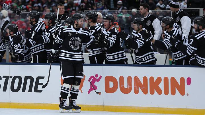
3. 2019 Winter Classic
I personally liked this sweater; however, many people did not enjoy the colorless approach. This uniform was replicated from the sweaters worn by the team in the 1920s and 1930s. It was a bold design that had a clean look but also a ridiculous amount of stripes that were overpowering when the team was in motion. Despite the large number of special event uniforms the team was tasked with designing, this one stood out as particularly unique, though it ultimately left fans wanting more.
The Blackhawks have a very rich history and tradition of logos and sweaters. In recent years, they have done an exceptional job of honoring the Native American community through both action and education. The pregame presentation detailing the Blackhawks logo with the Native American community is informative and one of my favorite parts of attending a game at the United Center. Overall, the Blackhawks have produced some fantastic sweaters over the years, and I greatly look forward to seeing what is coming down the pipeline.
 Add us as a preferred source on Google