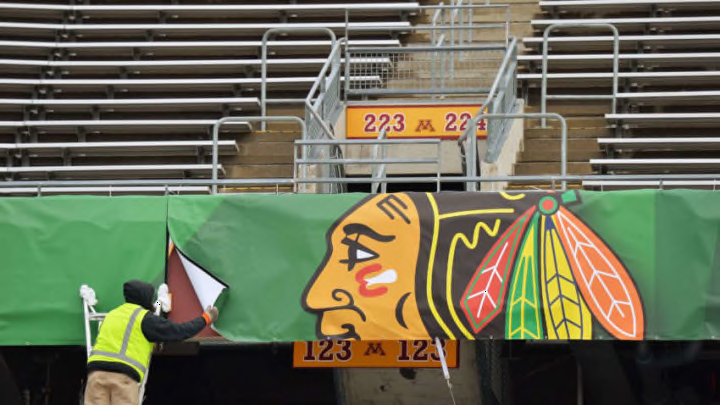
An NHL writer for The Athletic had a little fun ranking the league’s team logos earlier this week, but Chicago Blackhawks fans won’t be pleased with the results
You’ve got to do something to pass the time during the NHL offseason, as a Chicago Blackhawks fan or hockey fan in general. You can just watch baseball. You can look at “the olden days” for your favorite NHL team (I’ve done that a fair amount on Blackhawk Up). You can cry yourself to sleep.
The Athletic writer Dom Luszczyszyn, when he’s not working on content for that great online publication, decided to spend some time earlier this week ranking the 31 NHL team logos. (For the record, this was on his personal Twitter and not on The Athletic’s website.)
Blackhawks fans are unlikely to be pleased with the results.
this is how I would rank all the nhl logos. i'm certain you will all 100% agree pic.twitter.com/fNm3xUSrdr
— dom at the athletic (@domluszczyszyn) September 7, 2017
So, if you can’t see that tweet, the Blackhawks are either tied for 30th with the Ottawa Senators or unranked entirely, as there’s no number next to the Indian Head. You can scroll through the 164 (and counting) comments and find a reason for this, too:
I assume not ranked means "this shouldn't even exist"
— Satchel Price (@SatchelPrice) September 7, 2017
Concern over the logo, other logos
It’s no secret the Blackhawks’ logo has been swept up with other Native American-related sports logos in recent years, led by that of the NFL’s Washington Redskins (paired with even bigger controversy surrounding the team name). Opposition hasn’t been nearly as vocal to the Blackhawks’ logo as that of the Redskins, but it’s not as though none exists.
You can feel many ways about Native American names and logos being used in sports. You can look to history about the team name, courtesy good ol Wikipedia:
"(Team founder Frederic) McLaughlin had been a commander with the 333rd Machine Gun Battalion of the 86th Infantry Division during World War I. This division was nicknamed the “Blackhawk Division” after a Native American of the Sauk nation, Black Hawk, who was a prominent figure in the history of Illinois. McLaughlin named the new hockey team in honor of the military unit, making it one of many sports team names using Native Americans as icons."
You can also recognize that the first Blackhawks logo was black and white, not containing a yellow-faced man. But it has always contained a depiction of a Native American, and you may not find that to be appropriate or correct.
There’s no doubt, however, that this makes for an interesting conversation with logo enthusiasts and fans at large. Some may not feel comfortable trying to justify their ranking of a depiction of a Native American. Others may be able to detach politics and emotion from their thoughts on such logos.
Next: Blackhawks' Critics Need To Have More Faith
There have been many polls and rankings of NHL logos that have listed the Blackhawks’ entry at or near the top. And there are polls like Luszczyszyn’s that have done the opposite. It’s a divisive topic, but one that should be talked about.
